

What Does CTA Stand for in Marketing: The Ultimate Guide to Conversions
In the fast-paced world of digital marketing, capturing a user’s attention is only half the battle. You can design a breathtaking website, write a deeply researched 3,000-word blog post, and spend thousands of dollars on paid advertising campaigns. However, if your audience doesn’t know what step to take next, your marketing efforts will fall flat.
If you have ever wondered exactly what deos CTA stands for in marketing, how it influences consumer behavior, and how you can implement it to drastically improve your business revenue, you are in the right place. This comprehensive guide will dissect the mechanics of a call to action, analyze the psychological triggers behind high-converting buttons, and provide actionable blueprints to scale your conversions in 2026.
What does CTA stand for in marketing?
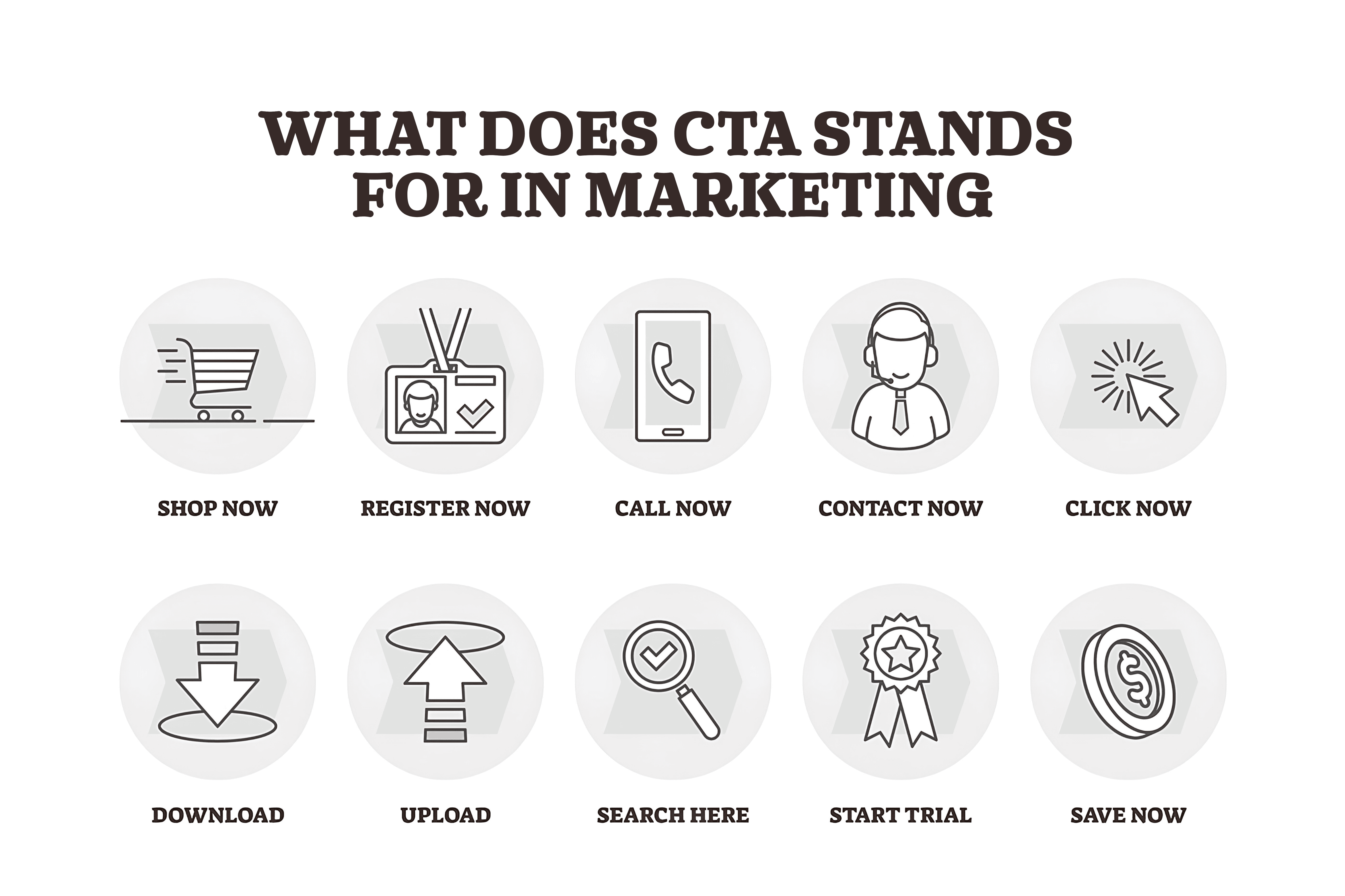
At its most fundamental level, CTA stands for Call to Action. In the marketing and advertising ecosystem, a Call to Action (CTA) is an instruction given to your audience designed to provoke an immediate response. It is a prompt—usually formatted as a button, a line of text, an image, or a verbal command—that explicitly tells the user what action they should take next.
Without a clear CTA, a user is left stranded on your digital asset. They might read your content, look at your product, and then simply hit the “back” button because no one guided them toward the logical next step.
The Evolution of the CTA
The concept of a call to action did not originate with the internet. It is a foundational pillar of traditional direct-response marketing.
- The Print Era: In old newspapers and magazines, a CTA looked like “Cut out this coupon and mail it to our office by Friday!”
- The Television Era: Late-night infomercials relied heavily on urgent verbal CTAs: “Call the number on your screen within the next 10 minutes to receive a double offer!”
- The Digital Era (2026): Today, a digital marketing CTA is highly interactive, dynamic, and integrated seamlessly into user interfaces (UI). It looks like clickable buttons reading “Get Started for Free,” “Start Your Trial,” or “Claim Your Discount.”
Why is a Call to Action Critical for Business Success?
Many businesses treat the CTA as an afterthought—a generic “Submit” button slapped at the bottom of a form. This is a massive mistake. A well-optimized, high-converting CTA serves as the bridge between two critical stages of the marketing funnel: attraction and conversion.
It Eliminates Decision Fatigue
Modern consumers suffer from information overload. When a user lands on a webpage, they want to expend as little cognitive energy as possible. A prominent, well-placed CTA acts as a signpost. It removes ambiguity, telling the user exactly where to click to solve their problem.
It Directly Impacts Conversion Rates
Your conversion rate is the percentage of users who take a desired action out of the total number of visitors. By running simple A/B tests on your CTA’s text, color, and positioning, you can see immediate spikes in your numbers. A successful conversion rate optimization (CRO) strategy almost always begins with optimizing the call to action.
It Drives the Customer Journey Forward
Every business has a customer journey map, moving a stranger from awareness to consideration, and finally to a decision. A chain of interconnected CTAs moves them smoothly along this path. For example:
- Blog Post CTA: “Download our free guide” (Moves user from Awareness to Consideration).
- Email Newsletter CTA: “Book a free strategy session” (moves the user from consideration to decision).
- Sales Page CTA: “Buy Now” (Finalizes the purchase).
The Psychology Behind High-Converting CTAs
An effective CTA isn’t just about good graphic design; it is deeply rooted in human psychology. To craft a phrase or a button that compels someone to click, you must understand the underlying mental triggers that drive action.

What does CTA stand for in marketing
The Principle of Urgency (FOMO)
Human beings are wired to avoid loss. The Fear of Missing Out (FOMO) is an incredibly powerful motivator. When a CTA implies that an opportunity is scarce or time-sensitive, the brain experiences a subtle psychological push to act immediately rather than delaying.
- Weak CTA: “Check out our summer sale.”
- Psychologically Optimized CTA: “Claim your 50% discount—Ends tonight!”
Value-Centric Phrasing (The “What’s In It For Me?” Factor)
Nobody wants to “Submit” a form or “Download” a generic PDF. Users want the outcome that the action provides. Your CTA text should always focus on the benefit, not the task itself.
- Task-Focused: “Download eBook.”
- Value-Focused: “Get My Free Marketing Blueprint.”
Reducing Risk and Friction
Clicking a button online always carries a perceived risk for the consumer. Will they spam my inbox? Will my credit card be stolen? Is there a hidden fee? A high-performing lead generation CTA proactively reduces this friction by adding reassuring micro-copy near the button.
- Example: “Start My Free 14-Day Trial” (with small text underneath reading: No credit card required). Cancel anytime.)
Types of CTA stands in the Digital Marketing Ecosystem
Depending on your business model, your campaign goals, and where your audience sits in the sales funnel, you will utilize different styles of calls to action. Let’s look at the primary types used in modern SEO content and digital advertising.
A. Lead Generation CTAs
These are designed to turn anonymous website traffic into identifiable leads by collecting contact information (usually an email address). They are heavily used in B2B marketing, SaaS, and professional services.
- Common phrases: “Download the Report,” “Grab Your Free Guide,” and “Join Our Insider Newsletter.”
B. E-commerce and Sales-Driven CTAs
These are straightforward, bottom-of-the-funnel triggers designed to capture a financial transaction. There is very little room for ambiguity here.
- Common phrases: “Add to Cart,” “Buy Now,” “Proceed to Secure Checkout” and “Claim This Deal.”
C. Content Discovery (“Read More”) CTAs
Mainly used on blog homepages, news portals, and media sites to keep users engaged on the platform for as long as possible. Increasing session duration sends positive signals to search engine algorithms, improving your overall search engine optimization ranking.
- Common phrases: “Read the Full Article,” “Continue Reading,” “Explore the Case Study.”
D. Social Media Engagement CTAs
Used on platforms like YouTube, Instagram, and LinkedIn to build community and amplify organic algorithms through user interactions.
- Common phrases: “Drop a comment below,” “Share this with a colleague.” “Subscribe for weekly updates.”
Anatomy of a Perfect CTA Button
An effective digital CTA is a masterclass in UI/UX design. If your button blends into the background or uses confusing copy, it fails. Here is the anatomical breakdown of an optimized digital marketing CTA:
Visual Contrast and Color Theory
Your CTA button should never match the dominant background color of your website. It needs to contrast sharply so that it instantly catches the eye of a user who is scanning the page.
- The “Squint Test”: Blur your eyes and look at your webpage. If your CTA button doesn’t jump out at you immediately, your contrast is too low.
- While color psychology suggests green implies “go” and orange implies “warmth,” the absolute best color is simply the one that provides the highest contrast against your brand colors.
Strategic Sizing and Whitespace
A button needs to look like a button. It must be large enough to tap easily on a mobile device (at least $48 \times 48$ pixels according to mobile accessibility standards) but not so massive that it looks aggressive or spammy. Surrounding the button with ample negative space (whitespace) prevents it from getting lost in a cluttered layout.

What Does CTA Stand for in Marketing
Clear, Action-Oriented Micro-Copy
The words on the button must start with a strong, active verb. Avoid passive language.
- Active verbs to use: Get, Start, Claim, Discover, Join, Build, Save, Run.
Where to Place Your CTAs for Maximum Impact
Positioning is everything. If a user has to search your page to find out how to buy from you, you have already lost them. Here are the strategic placements every business owner should implement:
Above the Fold (First Impression)
“Above the fold” refers to the portion of a webpage that is visible to a user before they scroll down. Every primary landing page or homepage must have a clear, distinct CTA here. This accommodates users who are already convinced and want to take immediate action without reading your full breakdown.
The In-Line Blog CTA
When writing long-form, SEO-optimized blog content, do not wait until the absolute end of a 2,000-word article to place your call to action. Scatter contextually relevant CTAs throughout the text. A banner or text link placed 30% of the way through the article captures readers who skip through or leave early.
The Bottom-of-Page Closer
For the analytical readers who scroll all the way to the bottom of your sales page, you need a powerful closing CTA. This is where you summarize the ultimate benefit of your offer and provide the final button to seal the deal.
Comparative Analysis: Common CTA Mistakes vs. Best Practices
To better understand how to refine your conversion rate optimization (CRO) strategy, let’s compare common execution failures against industry best practices.
| Element | The Wrong Way (Low Conversions) | The Right Way (High Conversions) |
| Button Text | “Submit” or “Click Here” | “Get My Free Audit” or “Start Saving Today” |
| Quantity | Slapping 5 different offers on one single page. | One primary action per page, repeated if necessary. |
| Contrast | Light gray button on a white background. | High-contrast accent color (e.g., vibrant orange/blue). |
| Mobile UX | Tiny text links that are impossible to click with a thumb. | Large, finger-friendly touch targets with whitespace. |
| Friction | Forcing users to fill out a 12-field form to get an ebook. | Asking for just a name and email address. |
Real-World Examples of High-Performing CTAs
To inspire your next digital campaign, let’s look at how world-class brands structure their calls to action to drive millions of dollars in revenue.
What Does CTA Stand for in Marketing
1. Netflix: Reducing Friction Instantly
- The Strategy: Netflix’s homepage is incredibly minimalist. The headline promises unlimited movies and TV shows, and right below it sits the CTA framework.
- The Text: “Get Started>” paired with a simple email input box.
- Why it works: It asks for the absolute minimum amount of information upfront to pull the user into the sign-up funnel.
2. Spotify: The Power of “Free”
- The Strategy: Spotify understands that the word “free” is an incredible psychological trigger.
- The Text: “Get Spotify Free”
- Why it works: It instantly eliminates financial risk. The user knows exactly what they are getting, and it costs them nothing to start listening.
3. Notion: Value-Driven Action
- The Strategy: Instead of using a boring phrase like “Sign Up,” the productivity workspace platform speaks directly to its target user persona.
- The Text: “Get Notion free”
- Why it works: It combines a value proposition (getting a highly functional workspace) with the elimination of a financial barrier (free).
How to A/B Test Your Call to Action | What does CTA stand for in marketing
You should never rely on guesswork to determine which CTA performs best. A/B testing (or split testing) allows you to show two different versions of a webpage to your audience to see which one yields a higher conversion rate.
Step 1: Isolate One Variable at a Time
If you change the button text, the button color, and the headline all at once, you won’t know which change caused the shift in performance. Test only the button color first, then test the text phrasing.
Step 2: Track the Correct Metrics
Ensure your analytical tools (like Google Analytics 4) are correctly set up to track click events. Do not just look at page views; focus entirely on the Click-Through Rate (CTR) of the specific button.
Step 3: Run the Test to Statistical Significance
Don’t end your experiment after 24 hours just because one version got three extra clicks. Let the test run until you have an adequate sample size (usually a minimum of a few hundred conversions per variation) to guarantee the results aren’t a fluke.
Final Thoughts
Understanding what CTA stands for in marketing is the first step toward transforming your website from a passive digital brochure into an active, 24/7 lead-generation engine.
A truly great call to action is
- Action-oriented: Starts with an imperative verb.
- Visually striking: Commands attention via contrast and whitespace.
- Risk-free: Lowers the barrier to entry for the user.
- Strategically placed: Follows the natural reading flow of your audience.
Review your digital platforms today. Audit your landing pages, check your email marketing campaigns, and look over your blog content. Replace every generic, uninspiring “Click Here” or “Submit” button with a dynamic, value-driven alternative. Your conversion rates, your sales pipeline, and your bottom line will thank you.